Design
The dark-only, dense, keyboard-first design system — the diff palette, draft violet, the stale gold, and the snapshot seal.
revu is dark-only, dense, and keyboard-first — a tool, not a landing page. The design was solved from the hardest constraint outward: a diff palette that has to survive syntax highlighting and color-vision deficiency at 2,000 lines. Once that was fixed, everything else followed.

Six hexes carry the app
The token plan spends its color budget deliberately. Most of the screen is warm-neutral near-black and ink; saturation is rationed to where it does work.
| Token | Hex | Meaning |
|---|---|---|
| canvas | #151613 | Warm-neutral near-black — explicitly not GitHub's blue-dark #0d1117. Steps: panel #1B1D19, raised #22241F, hairline #2E312B. |
| ink | #D9D7CD | Body text (~11:1 on canvas). Muted #96948A, faint #6B6A61. |
| add | #4CC8A8 | Additions — line tint at 9% alpha, word emphasis ~26%, gutter glyph at full strength. |
| del | #E5885E | Deletions — the same alpha discipline as add. |
| draft | #A48FFF | The single bold move: pending comments, the draft rail, the review-bar accent, selection. |
| stale | #D9B44A | Snapshot age, head-moved warnings, and reconcile "drifted". |
Danger (#E5645E) is reserved for destructive actions only. The focus ring is
neutral ink, never a semantic color.
The diff palette, solved first
The diff colors are the reason the rest of the palette works, and they were designed against four failure modes:
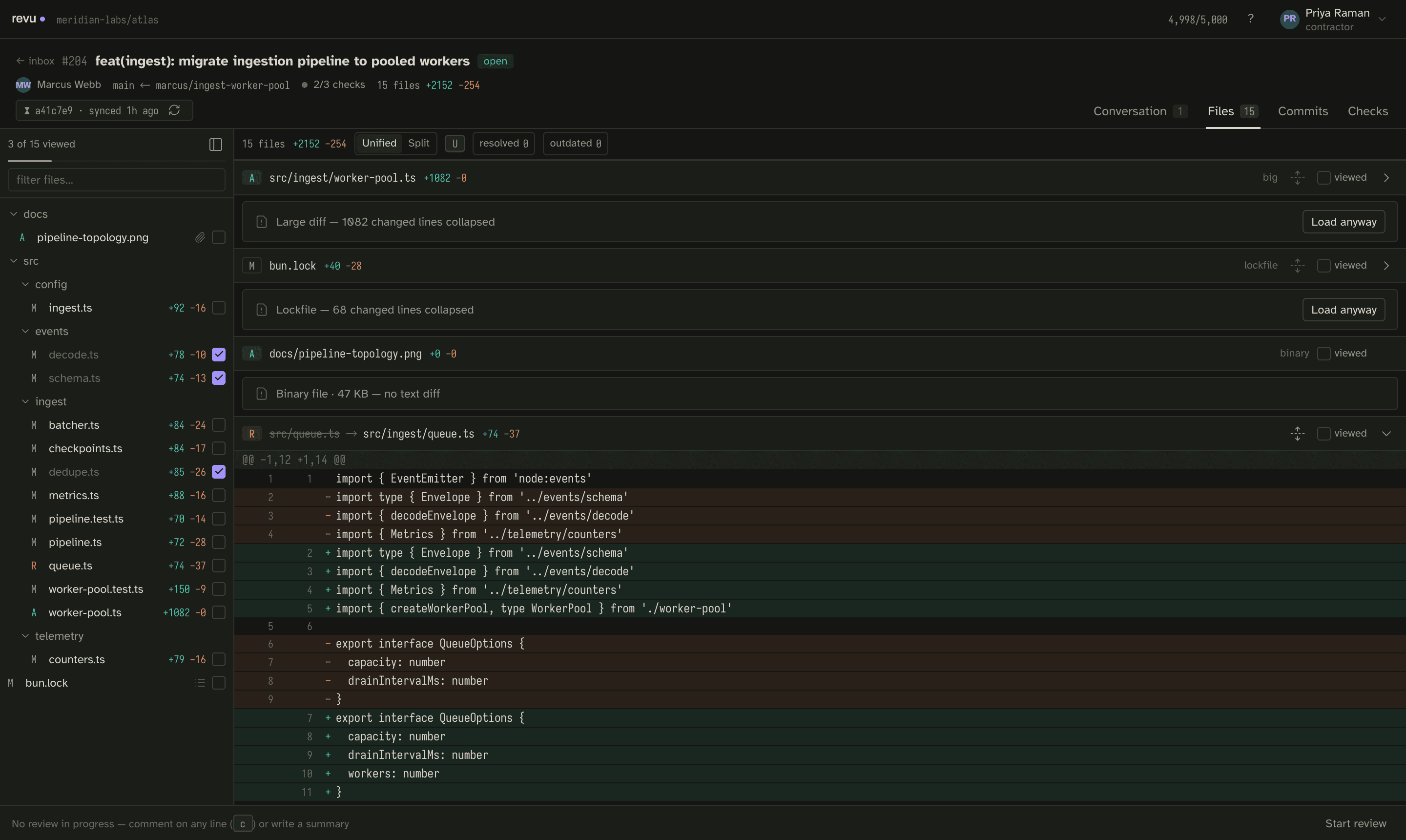
- Surviving syntax highlighting. The Shiki theme is co-designed with the diff tints: token colors stay in a neutral/cool low-saturation band (comments gray, keywords desaturated blue, strings warm sand at low chroma) so the teal/rust line tints at ≤10% alpha stay the loudest hue on the line. Word-level emphasis steps alpha (~26%), never hue.
- Not a Christmas tree over 2,000 lines. Saturated color lives only in gutters and word-diff spans; whole-line backgrounds are alpha tints of the same hues, so a large file stays calm.
- Red-green color deficiency. Teal (~165°) and rust (~20°) sit on the
blue↔orange axis, safe for deutan and protan vision. Color is never the sole
channel — the gutter always carries
+/−, and split view carries position. - Two warm yellows. Del pulls toward orange-red and stale toward brass so they never collide, and staleness always pairs a glyph with text ("3 new commits since sync"), never color alone.
Because add and del never appear outside diff surfaces, the two "brand" colors a user actually learns are violet (your unsent work) and gold (time moved under you) — the app's whole thesis in two hues.
Violet: the one loud thing
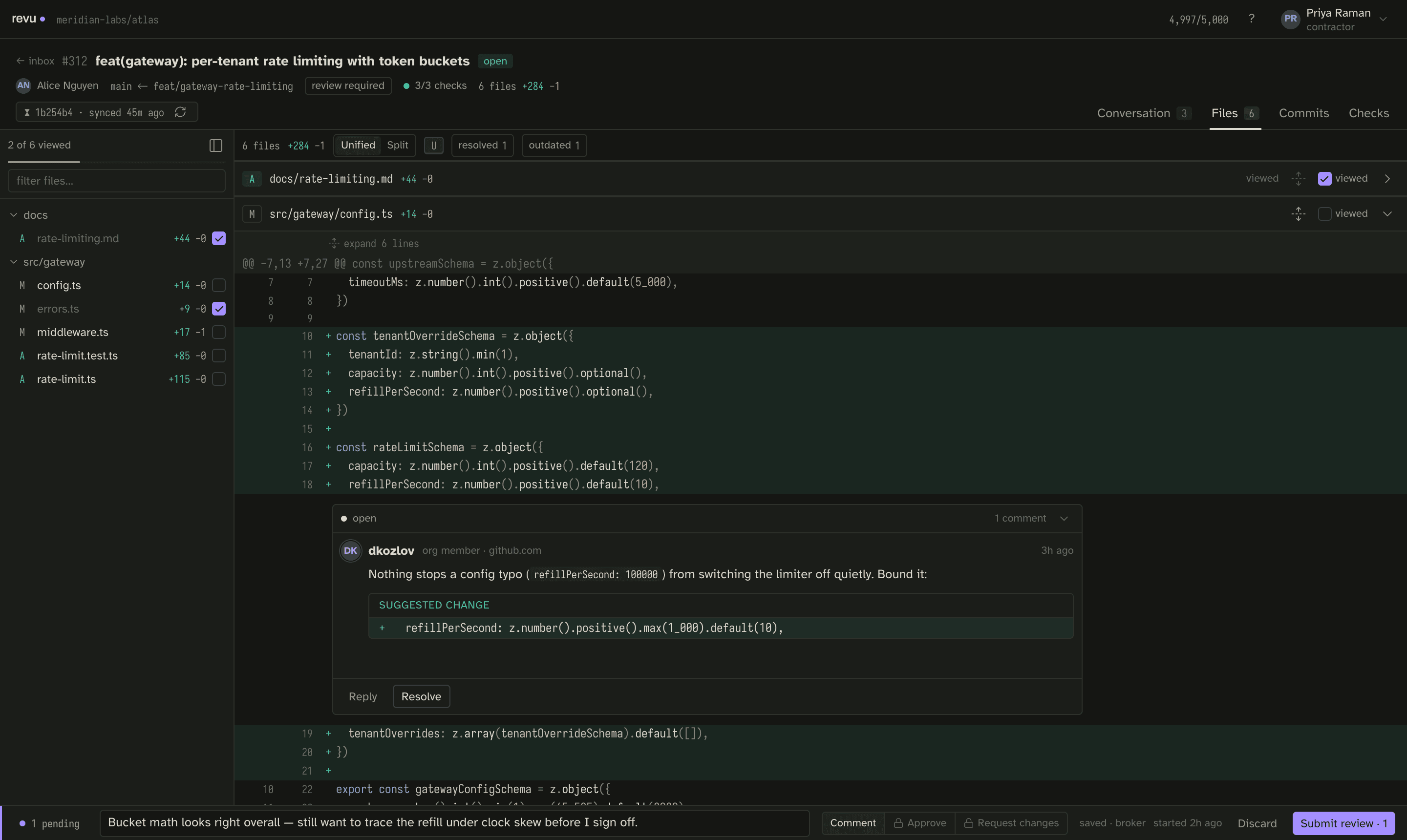
The palette spends its entire boldness budget on draft state — the work GitHub cannot see. Violet marks pending comments, the draft rail, the review-bar accent, and the current selection. If it's violet, it's yours and GitHub can't see it yet.
This is the one deliberate risk in the design: reserving the only saturated accent for invisible state rather than for brand or a call-to-action. It is taken on purpose — the draft's trustworthiness (it is broker-side, survives a rebuild, and is invisible to GitHub) is the product's hardest UX problem, and giving it the whole boldness budget is what makes "this exists and is safe" legible without a lecture. See drafts.
Gold: time moved under you
Gold means exactly one thing across the whole app: the world changed since you
synced. The signature element is the snapshot seal on every PR header —
⧗ b3f2a41 · synced 26m ago in mono. It is the offline-first contract made
visible: quiet and structural (a hairline-bordered mono stamp) when fresh, gold
with a re-sync action ("3 new commits — Re-sync") when the world moved. Staleness
is always glyph plus text, so it reads for someone who can't see the color at
all. See snapshot.
Type and layout
Three faces, each chosen for a job:
- Iosevka (mono) — a narrow terminal face that buys ~15% more columns in split diffs. It carries most of the screen (12.5px / 1.5).
- Atkinson Hyperlegible (body, 13px) — designed for legibility, fitting a tool whose work must read clearly to someone who will never meet you.
- Archivo (display) — the wordmark, section labels, and the big inbox numbers only.
Icons are Lucide at 14–16px, stroke 1.5. The layout is a dense three-pane workbench — file tree, diff, review rail — hairline-separated and laptop-half-screen safe: the file tree collapses to a rail below ~1100px.
Related
- Snapshot — the snapshot seal and its gold state.
- Drafts — why draft violet is the app's whole thesis.
- Keyboard map — the keyboard-first shortcut set.